Amanah Studios
A living identity system built around trust, exact geometry, editorial restraint, and a spectrum reserved for moments of energy.Trust made visible.
Amanah means trust, responsibility, and something placed in your care. The identity turns that standard into a precise, flexible system that can move from a quiet proposal to an expressive digital experience without losing its center.
Trust
Every choice should feel considered, legible, and dependable before it tries to feel impressive.
Precision
Geometry, spacing, and language resolve to clear systems rather than visual approximation.
Momentum
The identity stays calm at rest and becomes kinetic when a story or interaction needs energy.
Range
A monochrome foundation makes room for work across industries while the spectrum creates recognition.
One system. Two signatures. Every surface.
The approved wordmark introduces the studio. The standalone logomark carries recognition once context is established. Both use the same exact Futura geometry and adapt through color, scale, and a true transparent cutout—not redrawn artwork.
Approved wordmark variants
Use the complete Amanah Studios wordmark when the audience needs authorship or context. Its letters are immutable Futura BT Pro Medium outlines, paired with the official symbol as one lockup.
Responsive logomark variants
The circular mark can reverse across approved solid surfaces or become a genuine cutout over controlled imagery. The circle, contact points, counter, and projecting apex never change.
Use the wordmark at 160 px and above. Below that threshold, preserve recognition with the standalone mark.
- Wordmark
- Introduce the studio, sign authored work, and anchor formal communications.
- Logomark
- Use after the brand is established, in compact UI, avatars, and favicons.
- Cutout
- Use only where the background remains controlled and the silhouette stays unmistakable.
- Motion
- Animate only in digital contexts and always resolve to an approved resting variant.
Every contact is intentional.
The letterform is rebuilt as live SVG geometry. Three defining vertices meet the construction circle precisely, preserving the symbolism at any size.
Keep one quarter of the circle diameter clear on every side.
Use the mark alone below the minimum lockup width.
Align to the construction circle, not the projecting apex.
Monochrome first. Spectrum with purpose.
Paper and ink carry the identity. The seven accents organize energy, interaction, and category without becoming decoration.
#f7f8f4#0a0b0d#e53935#f57c00#f5c400#20a05a#1976d2#3f51b5#8e24aaFutura leads. Outfit keeps it clear.
Futura BT Pro Medium leads every title and display moment with disciplined geometry. Outfit supports body copy, labels, and interface text, keeping longer reading clear while preserving the identity's modern structure.
Aa
ABCDEFGHIJKLMNOPQRSTUVWXYZ
abcdefghijklmnopqrstuvwxyz
0123456789
Trust made visible.
96 / 91%Clear decisions, carefully made.
56 / 96%Strategy, design, and development.
28 / 110%A useful system should make the next decision easier.
16 / 150%AMANAH STUDIOS / NEW YORK
11 / 120%Structure creates confidence.
A twelve-column editorial grid supports asymmetric compositions, generous negative space, and clear reading order.
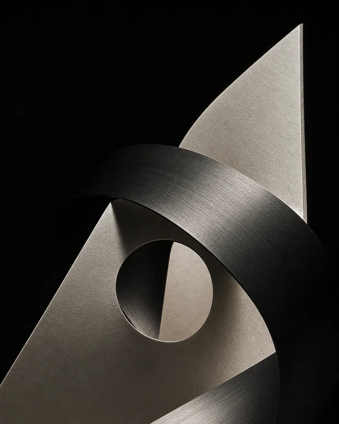
Material, scale, and directional light.
Imagery should feel constructed rather than collected: architectural crops, tactile surfaces, deep contrast, and a point of view that rewards attention.
Assured enough to be concise. Human enough to remain clear.
Amanah speaks like a close, accountable partner: clear about the stakes, specific about the work, and honest about what is known.
Name the decision, the stakes, and the useful next move.
Prefer concrete verbs and short declarative sentences.
Make expertise feel close to the work, not above the reader.
Empty superlatives, inflated agency language, and trend vocabulary.
Promises without visible proof or a clearly marked concept.
Technical language when a plain explanation is more accurate.
Message example“An expert design partner to get your project launched.”
Stillness establishes trust. Motion reveals range.
The mark remains exact while its two SVG geometries create motion studies: pivot, orbit, overlap, and prismatic color.
Protect the idea, not just the asset.
Consistency comes from preserving the decisions behind the system. These guardrails keep every application recognizably Amanah.
- Give the mark enough quiet space to preserve its edge contacts.
- Use the monochrome identity as the default structural language.
- Use spectrum color to communicate energy, category, or motion.
- Keep layouts editorial, asymmetric, and easy to navigate.
- Do not redraw, outline, skew, or soften the mark.
- Do not use several accent colors without a clear organizing idea.
- Do not crowd the lockup with copy, badges, or unrelated symbols.
- Do not substitute a generic letter A for the programmatic mark.